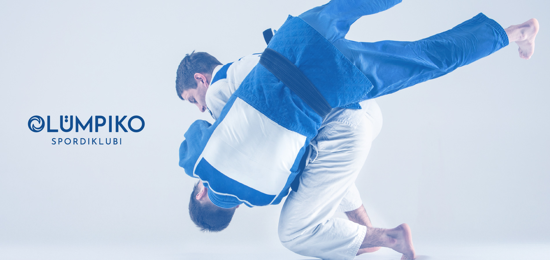
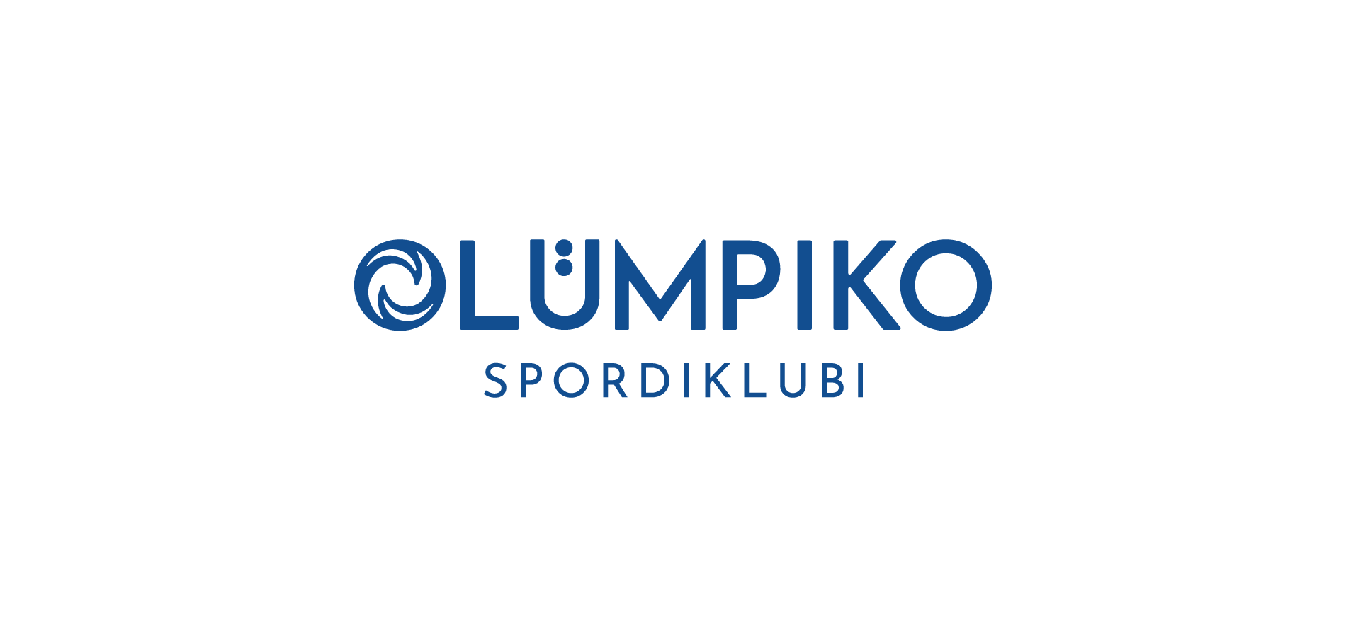
OLÜMPIKO
SPORDIKLUBI
A Jodu sport club in Tartu.
• Service: Visual Identity Design
• Client: Egert Ehari
• Designer: Hani Modiri
• Company: Walgus Media OÜ
• Location: Estonia
• Date: 2023
• Client: Egert Ehari
• Designer: Hani Modiri
• Company: Walgus Media OÜ
• Location: Estonia
• Date: 2023
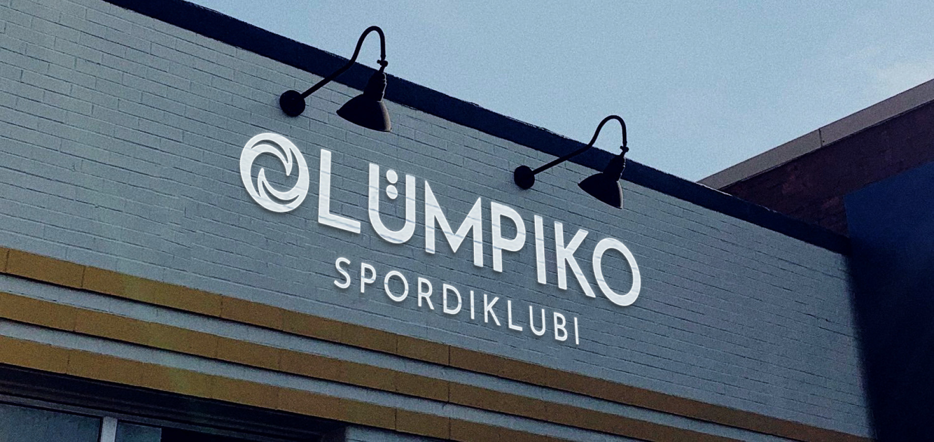
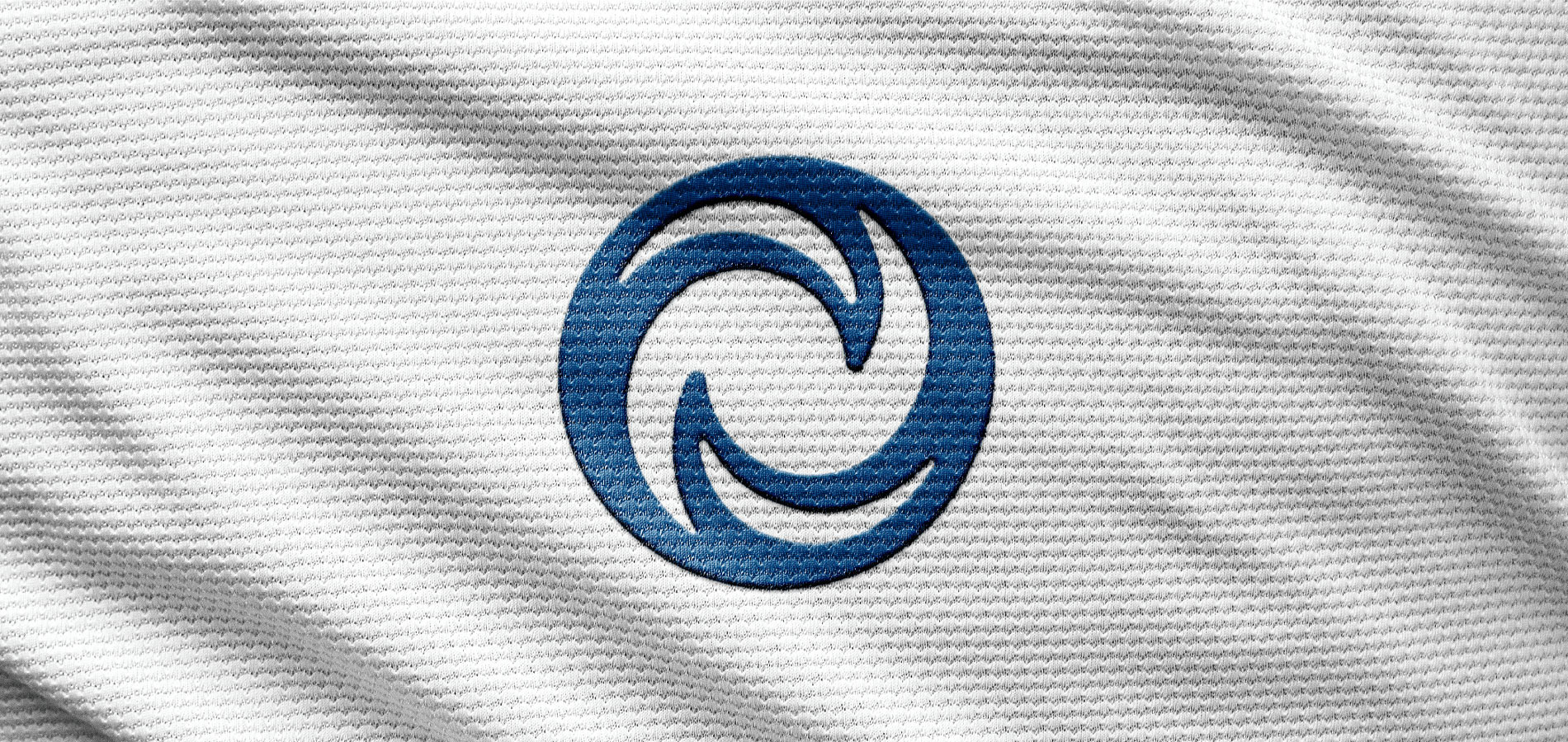
Logo Story
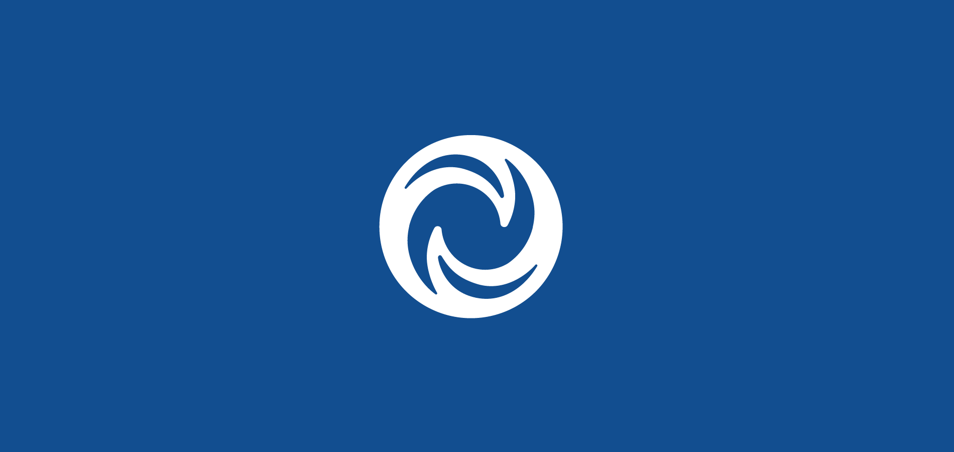
The shape of the logo symbol mentions Judo’s values such as ''focus'' and ''balance''. The letter ‘’O’’ was replaced by the symbol at the beginning of ‘’Olümpiko’’ to mention ‘’new beginning’’ and show ‘’efficiency’’ by using less space. The symbol is inside a circle and its shape conveys the feeling of turning to refer to ''cooperation'', ''continuity'' and ''courage''. Also, the inner part of the logo shows indirectly two Judoka who are fighting.
The shape of the logo symbol mentions Judo’s values such as ''focus'' and ''balance''. The letter ‘’O’’ was replaced by the symbol at the beginning of ‘’Olümpiko’’ to mention ‘’new beginning’’ and show ‘’efficiency’’ by using less space. The symbol is inside a circle and its shape conveys the feeling of turning to refer to ''cooperation'', ''continuity'' and ''courage''. Also, the inner part of the logo shows indirectly two Judoka who are fighting.

Thank you!